Hamilton, we have a problem
Council’s sheer breadth of services is showcased by its 37 incredibly diverse business units, while one is writing a policy on dog control, another is responding to a report of graffiti, and another is researching traffic movements across the city. Building out the primary user goals and key user flows, we determined the 12 customer-facing business units to put a digital lens across.
Interactive workshops across the 12 business units identified customer steps and pain points within user journey mapping. Interestingly, despite the diversity and unique user problems between business units, there was some commonality:
- Navigation was difficult, and search was impossible. The conventions in play didn’t align with modern user expectations, and often, weren’t a reflection of the information architecture hierarchy.
- Content was messy - many pages were unstructured, outdated, and much longer than they needed to be. Language also often mirrored how a business unit thought and spoke, rather than how a user needed to understand and use it.
- Accessibility was basic at best. Expectations in this area for local government have changed significantly in recent years.
A little learning makes the website sing
Council had a desire to not only be the best local government website but also have a “kick-arse website” that would generally stack up against the best sites in New Zealand. So we benchmarked requirements against other councils both in NZ and overseas, as well as other large NZ businesses, to look at how the best in class were solving similar problems.
We were empowered with a Council view on the role of the website and the problems visitors faced, but it was still untested. Each business unit had unique user problems that required validation to prove or disprove. So we moved into a user research phase with two distinct approaches.
Online surveys were used as a powerful and quick way to validate the simpler user journeys. The best way to really learn about a user’s experience isn’t to listen to what people say but to watch what they do. So for the more complex user journeys, in-depth usability testing allowed us to learn about a user’s experience by actually observing people experience the journey.
We’ve done our homework, incorporating user feedback and extensive market research to really understand what our users expect, while balancing the need for an agile site that can accommodate future updates
The UX melting pot
Everything discovered in the project to date, quite literally hundreds of insight points, was used to inform the website’s experience design. Through fidelity layering, the solution moved from a blank sheet of paper to something tantalising close to the real deal.
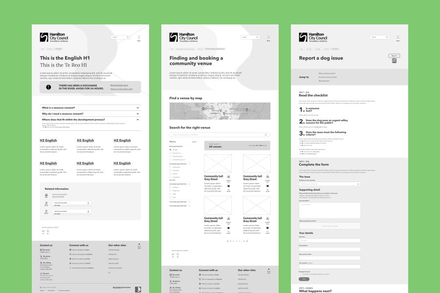
Low-fidelity prototyping, in sketch form, was how the key user flows were born - which not only showcased the basic skeleton of the new solution, it also plotted the storyline for the copywriting team. This simple showcase allowed quick collaboration with Council to get business buy-in, or modify on the fly.
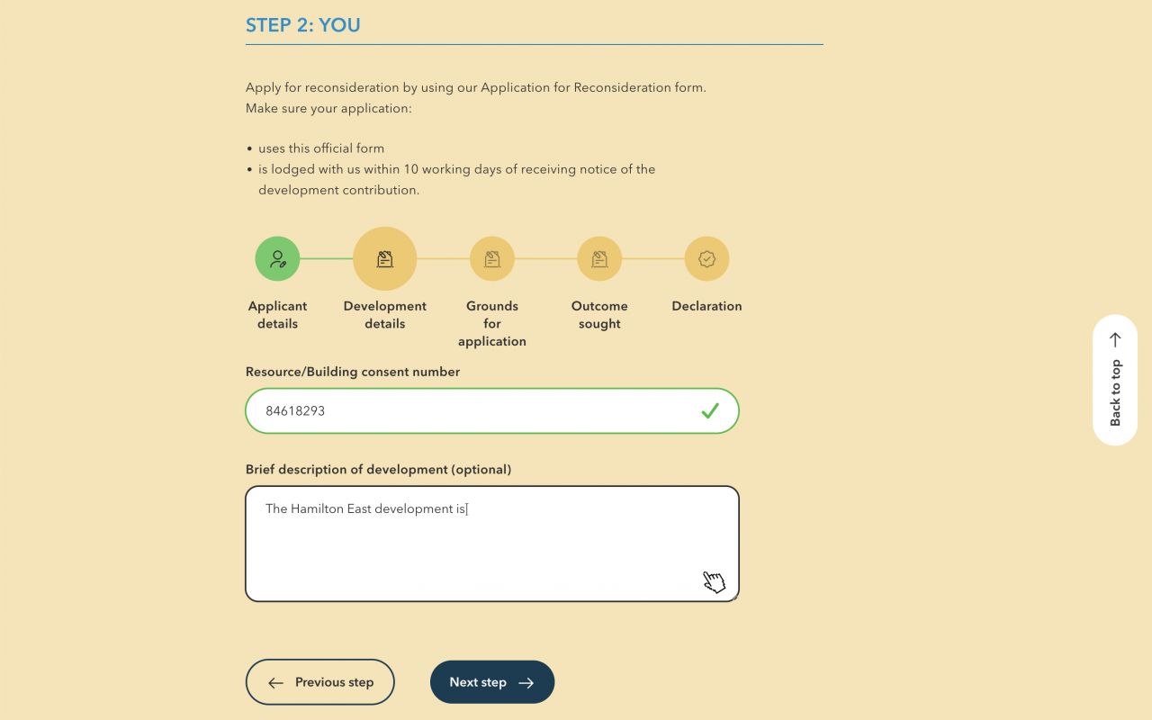
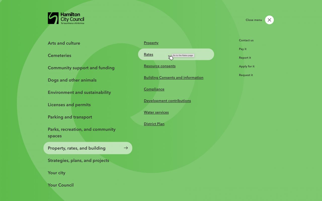
Medium-fidelity prototyping brought the experience design to life - design principles, design patterns, plus other UX goodness, got baked into the finalised user flows. Full pages and other necessities from the hamburger menu to the footer were realised in Figma as a black and white blueprint.
Supporting this work was the finalisation of the information architecture. Council started the project with more than 5,000 pages! A collective effort, ranging from user insight to an audit of redundant pages, saw the structure shift to 500 pages that now more closely reflected how users thought about Council.
UX is a research based discipline. It’s also a problem solving discipline. You can’t solve people’s problems if you don’t know what those problems are. Design decisions are based on these insights. Software exists to solve problems.
Beauty is in the eye of the phone holder
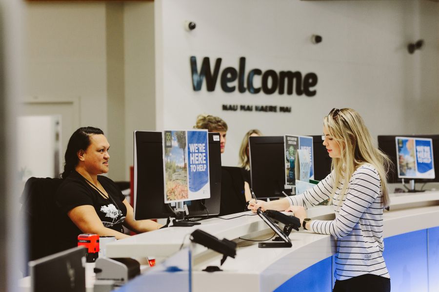
How should the Council brand behave in the digital realm? The challenge here was that existing brand guidelines were in play and far-reaching, across buildings and vehicle signage, right through to letterheads. However, as those guidelines were already missing a digital component, there was an opportunity to expand them in this realm to at least ensure the digital front counter was singing the right tune.
We defined this tune as one which was vibrant, connected, diverse, and representative of an organisation geared to improving the well-being of its city. Working with our brand design partners on this project, Head & Tail, we moved through an ideation phase with Council to ensure we were not only representing the fresh brand vision but also operating within necessary brand boundaries.
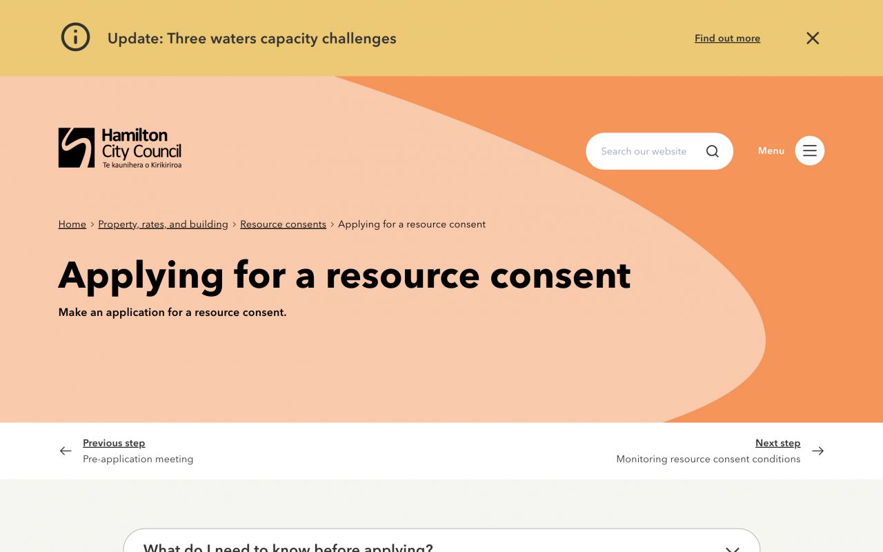
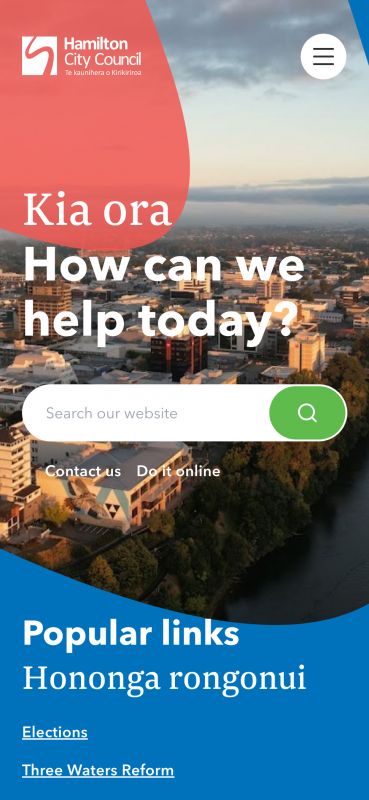
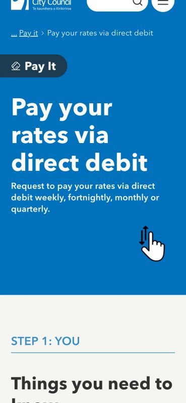
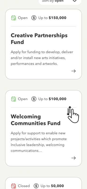
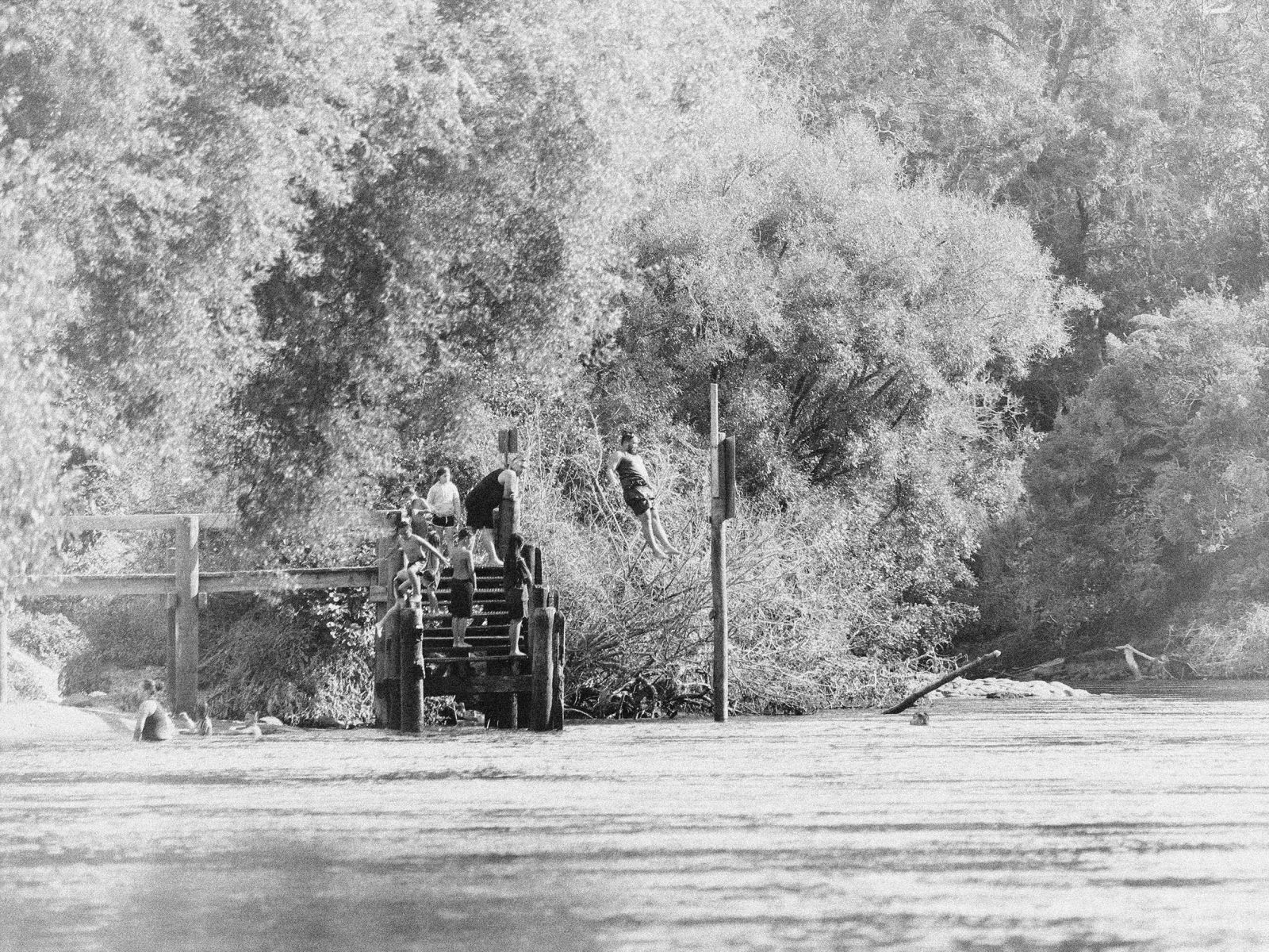
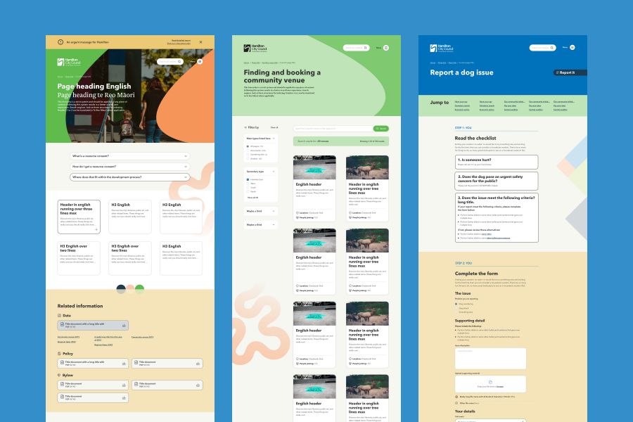
The existing palette was updated to focus on combinations that were friendly, modern, and vibrant. An authentically Kiwi font was introduced to allow for te reo Māori inclusion in content. The primary graphic river motif was expanded by adding uniquely Kirikiriroa supporting graphics - from the Fairfield Bridge through to paddocks and fog. These recognisably local touches were able to be used in backgrounds, as dividers, and as photography overlays within the content.
Anchoring all this were key digital inclusions, interactive components and a defined grid system, wrapped nicely into a fresh digital design system. A single source of truth for communications, marketing, development, UX, and UI design team members to keep uniformity across the future digital ecosystem.
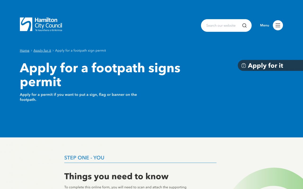
Finally, the beautiful marriage of experience design and the digital design system came together through UI design for the whole site came to life. Feeling is so important in this phase - great brand work strikes a chord implicitly with users. While the experience design had already been signed off this was the real-world test of hitting the right notes with the new digital identity.
Branding wise - it’s phenomenal! It’s not your typical local government - it feels more modern, more up-to-date, more approachable. It’s a really great design system to work with.
Under construction 404 a while
Gearing up into the development phase, an agile scrum team was formed comprising a cross-functional team from both Council and Dynamo6. This tight-knit, focused team allowed for high development velocity as well as the flexibility to adjust to constraints as they arose. The close collaboration with Dynamo6 gave Council a high level of transparency into the development process and provided minute control on when requirements were considered done, or when they needed more work - optimising where time was spent as we progressed.
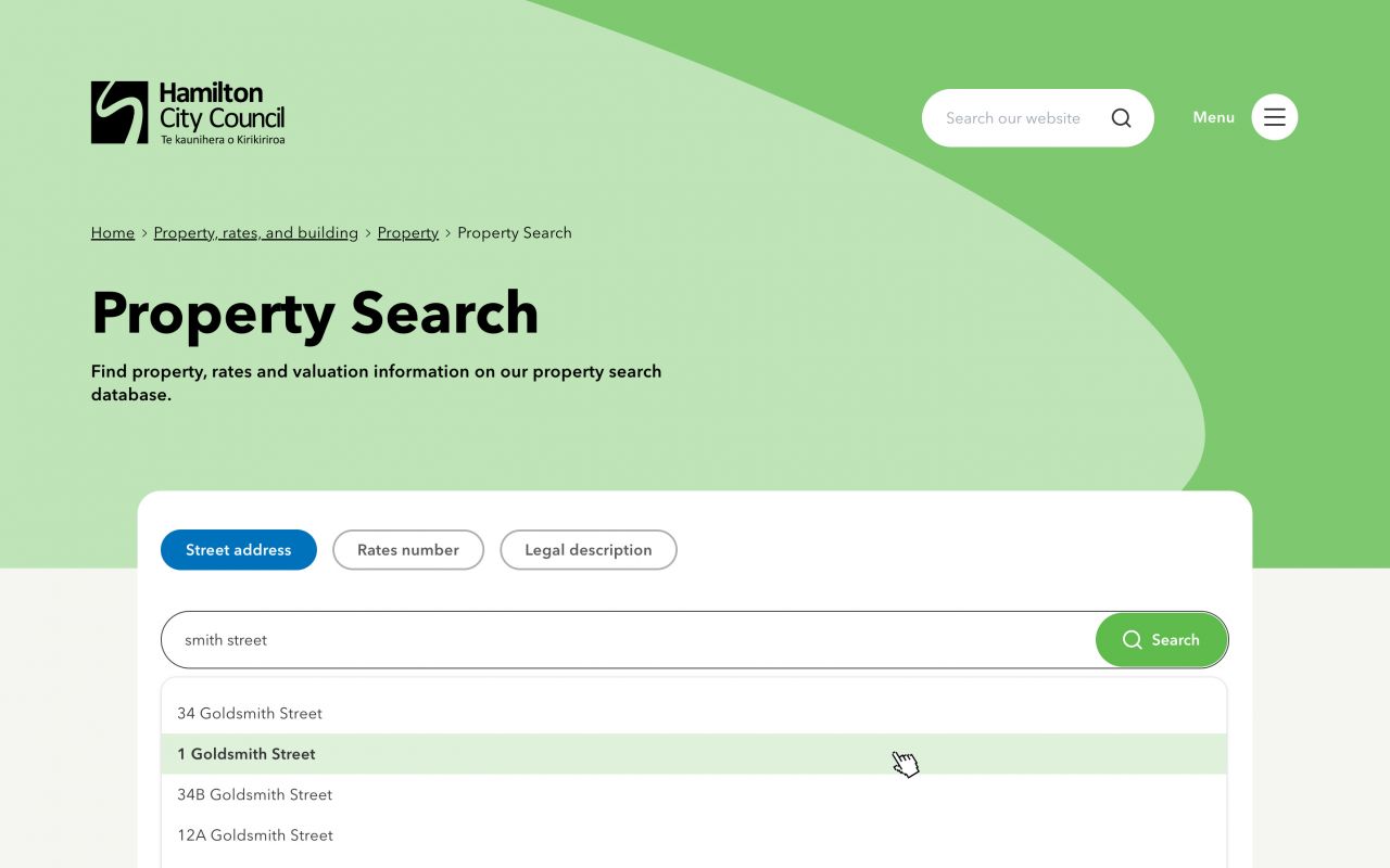
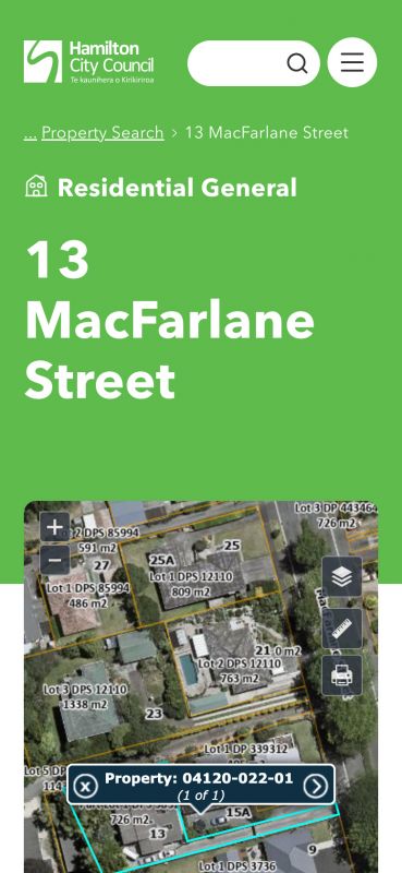
Utilising the Silverstripe CMS platform, a powerful, security-conscious solution was developed that met the unique requirements of Council. Integration across Council APIs allowed unique information directly from Council platforms to be presented to the public. Cemetery search and property search were two big examples of this.
Doing some dime spinning
The scrum project structure allowed the flexibility to pivot in the middle of the development phase. Council had been migrating to Hubspot as a parallel project and, when they came to building out content management and delivery for news, they realised this would be best suited inside the main Council site. So we pulled that requirement into the project and built out integration with Hubspot to present news from within the site. This also had the added benefit of reducing the number of public-facing web properties Council needs to maintain while continuing to get the benefits of Hubspot.
Search and (now) you will find
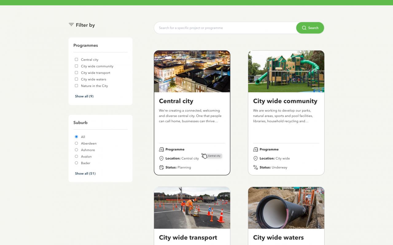
Search needed something special, since this was a strong theme since the early days of UX research. The new search overlay, front and centre on the website, offers deep levels of filtering and gives different data types a unique look for easier selection. While its result and search term summaries support different search needs - from niche searches by experts to casual searches a Hamiltonian resident would make.
The powerhouse of the search experience is an Elasticsearch appliance. Fuzzy logic, relevance tuning, and semantic search are all baked in.

This is a really significant milestone for us - probably the biggest change in how we meet our customers’ needs in the last few years. The quality of D6’s work on this project has been excellent, from visual design to site architecture to development . I think we have a website which is world-class now.
We love being a good host
Council had some big demands on hosting the new website platform. Dynamo6's Enterprise Hosting was designed from the ground up for security. The hosts are hardened to CIS benchmark standards, and powered by Google Cloud.
Autoscaling and load balancing mean the host handles traffic peaks and costs are auto-optimised. Autohealing hosts provide robust but hands-off stability. Google Cloud Armor’s network security helps by providing DDoS protection and WAF config, which also forms part of the mitigation against the OWASP top ten web application risks.
Continuous deployment is enabled for both production and staging environments. This means we can get new features in front of end-users quickly for fast feedback loops. Overall providing speedy and quality deployment without manual deployment overheads.

Landing the plane with runway left
The new digital front counter really is a huge step forward in presenting who Council is to Aotearoa and the rest of the world. It starts with the exciting new digital design system. No 1980’s office vibe here - it really just feels good. While UI design plays an important role, a new way of talking really showcases that Council is in tune and connected with its diverse community.
The original common challenges that came out of the research were reimagined:
- Navigation now reflects an information architecture that is anchored by research. The grouping and labelling of information now makes sense specifically to how the user expects it to. Central to this is a powerful, relevant, and constantly improving search engine.
- Content has been completely refreshed. It now follows a structure that’s not only scannable by a user but also much more digestible. With a language shift to ‘how the user understands it’, it’s a much more positive experience.
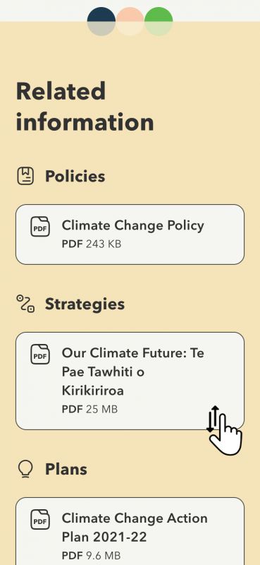
- Accessibility was lifted to be able to meet the standards required for WCAG 2.1 AA. Additional brand touches, such as custom iconography, further contribute to breaking down barriers.
The whole digital experience is now one that a user doesn’t need to think about. Intuitive navigation cuts away cognitive load and enables users to complete their goals with ease. And of course, it’s all backed by a powerful underlying technology platform that will help Council with their ambitious 5-year vision - supporting an aggressive time to market rather than just keeping the lights on.

This new website is a massive turning point for Hamilton City Council and how we build our services. It ultimately helps our communities by making things easier, whether they’re registering a dog, paying a parking ticket—sorry!—or finding a playground to take your kids.
Throughout the whole thing the Dynamo6 team were just great. The extra things we needed along the way were included. The problem-solving and technology solutions have come together seamlessly.
The Council is now in a really, really good position from the groundwork laid through this project. This massive improvement helps the council move towards its plan of consolidating its website infrastructure, consolidating hosting, and consolidating digital support across the numerous active sites the Hamilton City Council operates.
