Dynamo62.0—
abrandjourney
What a ride! 16 months later and it’s finally released to the world. Yet it hasn’t been plain sailing. There’s been a lot of hard graft and many impassioned discussions to get to this point. Here’s our journey from Dynamo6 to Dynamo6 2.0.
what version is this one again?
It’s a common problem, companies with development prowess seem to struggle to land their own website. Or perhaps I should say a site they’re happy with. Unfortunately, Dynamo6 was no different. I don’t even want to mention how many previous versions went south. However, we were more than determined for this one to be very different.
let’s treat this as a customer project
While previous obstacles varied there were certainly similarities that gave insight. You need the right team on the job. You want stakeholders and their requirements — but you also need rules on their input. Product integrity is important — keep the stakeholders happy but don’t forget the user. You need dedicated time to actually build the thing. And most importantly you need to follow the right process, the full digital experience, from business analysis and UX through to visual design and web development. There’s no jumping ahead in the queue.

brand discovery
Rebuilding our website, in fact, became a journey of self-discovery too. What really kicked this project into life were two crucial questions, “what do we do?” and “who are we?”. They seem simple enough to answer, but they really did take some time to hone. Answering them enabled us to set a solid direction.
what do we do?
Dynamo6’s capabilities and service offering had grown across its 8-year history. None more so than the previous 2 years. Taking stock of this, redefining the offering and reviewing our place in the market versus our competitors was more than a handy exercise. It enabled us to pinpoint our point of difference. That point of difference was something unique, something which set us apart from our industry peers. This would become a central part of defining who we are.
who are we?
Of course, there was a slight element of “who do we want to be?” mixed into defining this answer but we were conscious from the word go that a strong brand builds a strong business. There’s so much value generated for a business in brand recall, brand credibility, brand trust, and the holy grail of brand loyalty. Obviously a website is one piece of the brand puzzle so this early work was also setting a direction that would ultimately filter through the rest of the business.
Following some passion fused workshops, we were able to define our brand personality and brand values. These were influenced by a specific mix of brand archetypes. D6’s tagline and positioning statement were next. On completion, and for the first time in some while, we were able to deliver an elevator pitch on exactly who Dynamo6 was.
a step towards our visual language
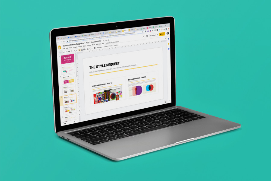
Visually, we thought carefully about what should be kept from Dynamo6 1.0, yet we also looked under the hood to understand how and why these components worked. We particularly considered the key design elements within. With further thought on first impressions we wanted to make with customers we had started to define a visual direction.
With a decent portion of our business hidden from view and in the cloud, we needed to enlist a graphical approach that would represent the business as a whole. It needed to work with the visuals we generate from customer facing digital projects too, such as web or app design. Graphic modernism was starting to hit the right notes for us. But it also needed a bit more to bring our personality to life.
An audit on D6-isms verified the symbols and items important to us as a brand. These were things that could be adapted for use within the graphical style for web design but that could also be used separately across other branded collateral. A creative brief was forming.
To round out the creative brief, we mood boarded different interpretations of graphic modernism. We then overlaid the components noted above. These steps helped us to nail our final thoughts on colours, logos, typography, and photography too.
UX-ing things
We made an interesting call right at the beginning of this phase. We had an existing website we could test but we decided not to. Usability testing has a tonne of benefits but we wanted to go back to the drawing board on this one — Dynamo6 2.0 was quite simply a different beast.
This version was to be about the brand experience as much as it was about what our customers needed. We knew our customers so we had their personas in mind. We understood their customer journey with Dynamo6 and where the website fits into that mix. This gave us a collective design target to work with.
The information architecture and navigation for the new website was relatively straight forward — it’s not a complex site. And based on the above, the flow through it was largely already detailed.
In today’s age, the UX bar is set high. Function is no longer king and design is no longer about colouring in the numbers. The new glue on the block is experience. When the tech giants are the benchmark, user expectation has never been higher. I come across some shocking experiences online, unfortunately, I remember those more so than the good.
A website should work the way a user expects it to, it should give them what they need without trouble, and they should walk away feeling good about the experience. And with a job done really well, the brand should also connect with them at a subconscious level.
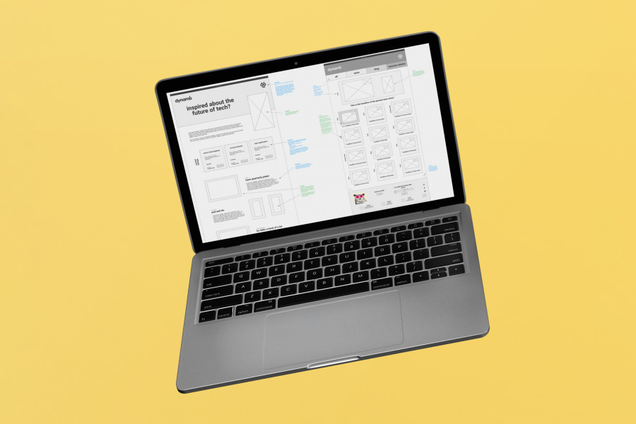
With digital experience and software development now a key part of D6’s offering we needed to conduct competitive benchmarking against our competitors in this space. We considered industry conventions and assessed what was and wasn’t working well. Where inspiration was drawn, we emulated or evolved it in our prototyping.
Inspiration for prototyping wasn’t just limited to the above. Yes, we included bits and pieces from those within the cloud engineering space. But we also extended our research to other industries where best practice had been celebrated and awarded. On top of this, there was the influence of design patterns (chunking, alignment, and visual hierarchy for example) and design principles (from perceivability to affordances and feedback).
content creation
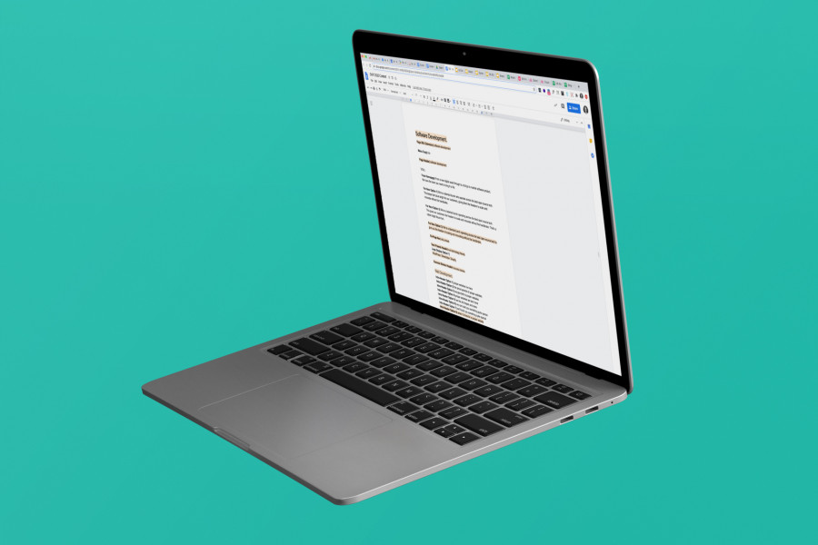
Content writing was quite possibly the most difficult task we had during the project. At one point an entire round of copy was thrown into the bin. The work on brand personality was happening concurrently to this and in hindsight, it should have been done first. However, as tone of voice is so intrinsically linked to brand personality it was really helpful to see it come to life at the same time.
Photography was another decent push for this project. When you sit down and take a look at the sheer amount required for a website can be slightly daunting. But working to a set style you instantly streamline things — the final result is all the better for it too.
our visual language
Over the past two years, we’ve established a network of designers that can be utilised based on what the project demands. This creates a range of flexibility and capability for our customers. The creative brief established for this project in truth did demand something more than your typical UI designer. We needed a design team that also had art direction, illustrative, and animation skills but fundamentally understood UX in 2020.
While we briefed a handful of designers there was one, in particular, we had high hopes for, Head & Tail — and they didn’t disappoint. They’re a Dutch duo anchored by art direction with amazing graphic design and illustrative skills. Their work across product and print for artistic minded business, galleries and institutes is simply beautiful. The digital interpretation of this work for UI purposes is equally on point. They also totally get UX.
Head & Tail were the only designers we briefed who fed back with a well thought out proposal that included more than just a cost. They really dug our research and early concept work but could also see the direction we were heading was more than just a digital focus - we were essentially asking for a design language for the brand. Needless to say, they were super excited about the prospect of the project, so much so that their proposal included early thoughts which were refreshing to read. Instantly, we knew they were on the same page as us.
Two early concepts were presented. As you can imagine, with options to hand, you tend to pick from both. This however, like the rest of the visual design process, drove a real collaboration on colours, typography, photographic approach, D6 inspired elements, illustrations, our new mascot, animation examples, and micro-interaction examples.
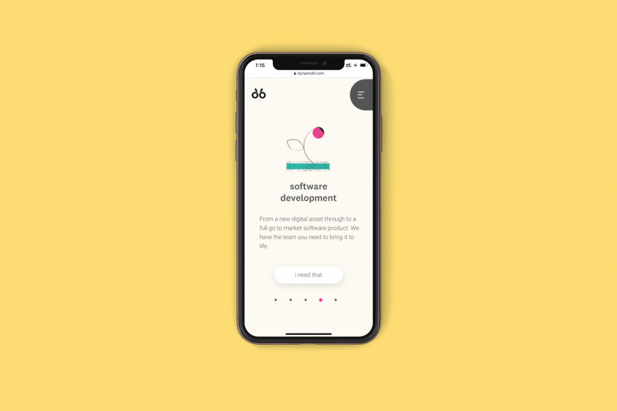
The final delivery on web design put an exclamation against a fantastic piece of work. Yes, prototyping influenced layout, but as hoped, the freedom given to design influence had been worth it — it always adds something magical to a page. Head & Tail took our early work, added their unique style to it and helped us create a visual language. This visual language is now on our website but also currently filtering throughout other areas of Dynamo6.
getting ready for the brand roll-out and build
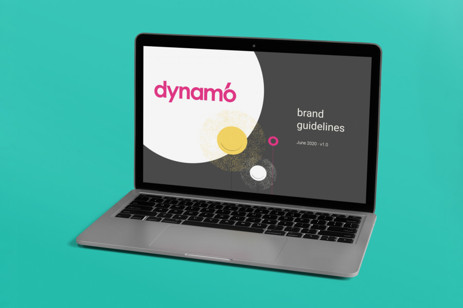
We captured the visual language, alongside other key brand attributes in a snazzy set of brand guidelines. This included our tone of voice through to brand consistency tips for the team. It provides a handy single source of truth for the team.
Then the prototypes became wireframes, detailing the final direction on micro-interactions and animations through to rules and feedback for the user interface.
the branded result
Our challenge throughout this project was in ensuring the brand did each service area justice while celebrating their collection as a differentiator for Dynamo6’s service offering versus competitors.
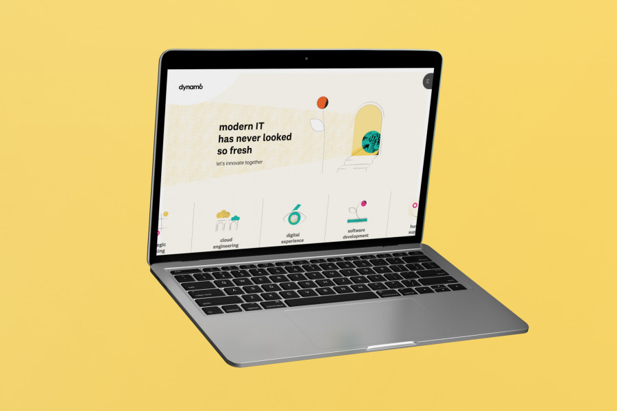
I’ve purposely held back on giving too much away above. The process is captured however the result doesn’t need to be spelt out. You can see it. You can experience it. So enjoy the website and hopefully, we’ll see you in our Hamilton office soon.
we're here to help
If you'd like to chat on how we can help your business with the digital experience or software development, reach out to us.